
Style Inspiration POS NEG by Elly Paynter
- Oct 20, 2025
- 2 min read

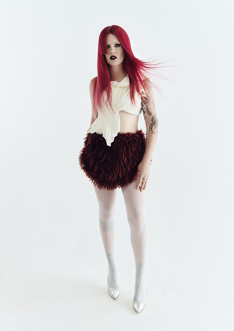
‘POS NEG‘ explores the dynamic relationship between positive and negative space, interpreted through hair cutting and colour. Inspired by the tension and harmony that exists between being present and being absent, each look uses bold split tones, colour blocking, and dramatic shapes, creating a juxtaposition between that positive and negative space. Feature colours of red, orange, and blue are intermixed with anchor tones of black, brown, and blonde to create structured voids and vibrant fills - transforming hair into a living sculpture of artistic expression. The cutting techniques emphasize silhouette and shadow, celebrating both the seen and the unseen with sharp edges and deliberate spaces. Colour and shape are manipulated to echo the rhythm of space - softer, more subtle elements collide with texture and movement, while the overall aesthetic remains editorial, edgy and vibrant, and predominantly high-impact. Through this lens, hair becomes not just a medium of beauty, but a canvas of visual storytelling, where absence is just as powerful as presence.


HAIR – Colour Inspiration
Working to the concept of negative and positive space, presence and absence, I was inspired to create and work with a colour palette that reflected this, and complemented the hair cuts. Bold, feature colours of red, orange and blue were anchored by black, brown and blonde hues with a combination of daring and subtle colour placement enhancing and exaggerating the texture and movement within the styles. Androgyny fused with femininity, strength melded with softness, dramatic shapes were brought to life with split tones and colour blocking techniques to really accentuate texture and impact the shape of the expertly crafted styles.
MAKEUP
For this shoot, skin was kept clean adhering to the brief of minimalist but high impact. The overall theme of movement, texture and juxtaposing positive and negative space, was reflected in the eye makeup; this was deliberately messy and blurred. Lips were defined with liner and were either impactful and bold, or left more natural.
STYLING
The extensive styling colour palette was composed of blues, greys, silvers, reds, cream and white with varied textures and finishes – fluffy, metallic, rough and sheer. Reflecting the overall feel of the shoot, we choose to layer the tonal outfits with bold elements that blend beautifully with the elements and storytelling introduced through the hair.
PHOTOGRAPHY
The initial brief for the shoot backdrop was muted blue, grey or cream, however we opted for a muted pale blue which delivered cool warmth and allowed the hair cuts & colour to shine.An commercial yet editorial vibe was created using a combination of full/half body images and profile shots which allowed the hairstylist and photographer to play with lighting and contrasts. The result was a slightly desaturated or mildly blurred editing style that created a nostalgic, retro essence within the finished images.
Colour / Styling: Elly Paynter (instagram: ellyhairpaynter)
Cutting / Styling: Ryan King (instagram: ryankinghaircutter)
Photographer: Georgia Wallace (instagram: georgiawallacepictorial)
Fashion Stylist: Ysha Giorno (instagram: caesura)
Makeup Artist: Brooke Clarke (instagram: brookeclarkemakeup)
Comments